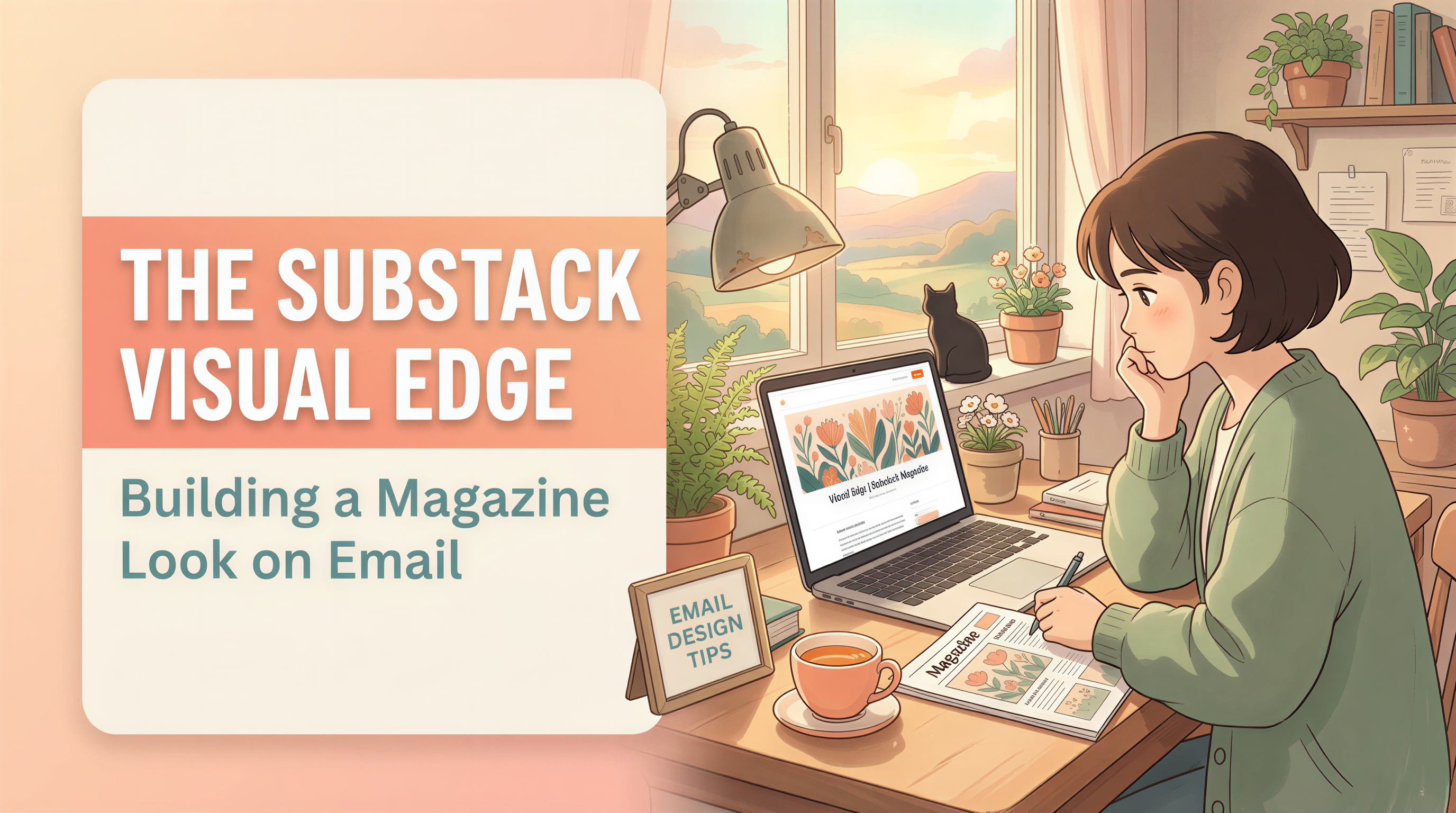
The Substack Visual Edge: Building a Magazine Look on Email
Open Substack on a Monday morning. Scroll the inbox.
Most newsletters look identical: bold headline, plain text, maybe one stock photo. They blur together.
The ones that feel like a magazine - those get opened first. And read longer.
Here's how to build that look without hiring anyone.
Table of Contents
- What "Magazine Look" Actually Means
- Why Most Substacks Skip This
- The Header That Sells the Open
- Sizes That Work in the Substack Preview
- The 3-Section Magazine Structure
- The Workflow That Makes This Sustainable
- What "Locked Style" Looks Like in Practice
- Newsletters That Already Do This Well
- Common Mistakes to Avoid
- Cross-Pollinate to Your Blog
- Build Your Magazine Look This Week
What "Magazine Look" Actually Means
Three things, in order:
- A real header image - on every post, in a recognizable style
- Section breaks with visuals - not just walls of paragraphs
- Visual identity - your newsletter's images look like yours
Not template-y. Not Photoshop-heavy. Just intentional.
Why Most Substacks Skip This
Two reasons:
- "I'm a writer, not a designer."
- "Stock photos look generic, custom takes too long."
Both are true. Both are now solvable in under 5 minutes per post.
The Header That Sells the Open
Substack shows the header image in the email preview. Inbox attention is short. The header has to do two jobs:
- Match the post topic - so opens are real, not bait
- Look like the last 10 newsletters - so subscribers recognize you
Generated images using a locked style hit both. Stock photos hit neither.
Sizes That Work in the Substack Preview
The inline header renders at different sizes across email clients:
- Desktop preview: ~600px wide
- Mobile inbox: ~300px wide
- Open email: full width
A 1200x630 image covers all three. Don't put critical text inside the image - it'll be unreadable on mobile.
The 3-Section Magazine Structure
Steal this layout for your next issue.
Header (above the fold)
One image. One headline. One sentence of teaser.
Section breaks every ~300 words
A small inline image at each major section. Same locked style.
Closer (above CTA)
One image with mood that matches the post's takeaway. Sets up the close.
That's it. Three image touchpoints. Magazine feel.
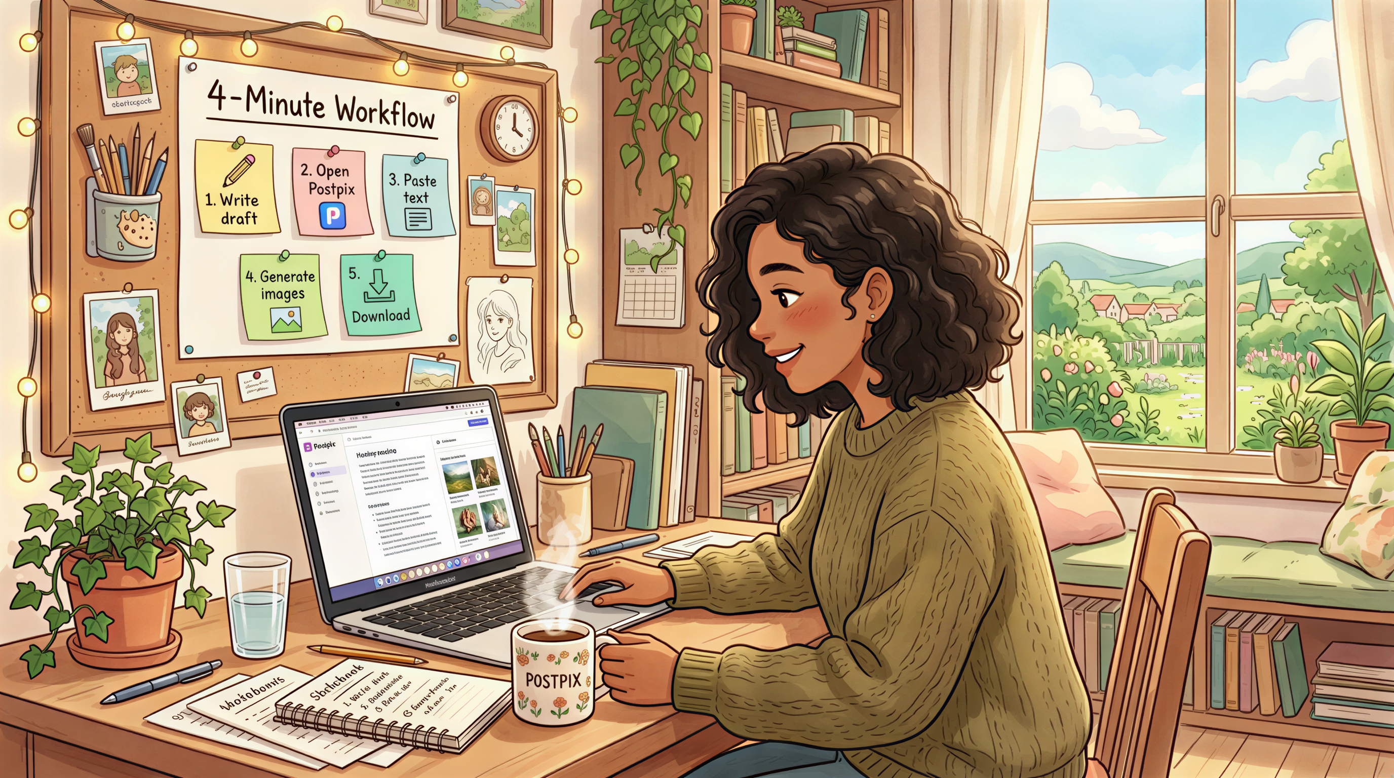
The Workflow That Makes This Sustainable
If each issue takes an extra hour for design, you'll quit. If it takes 4 minutes, you won't.
The 4-minute path:
- Finish writing in your draft
- Open Postpix
- Paste each section heading - generate one matching image
- Download all three
- Drop them into Substack
Done. Magazine-looking newsletter shipped.
What "Locked Style" Looks Like in Practice
Pick once, use forever:
- Ghibli-painted (details)
- Editorial photoreal
- Sticker / illustrated
- Isometric
Lock the style for at least 6 months. Resist the urge to "try something different" mid-year. Visual consistency is the brand.
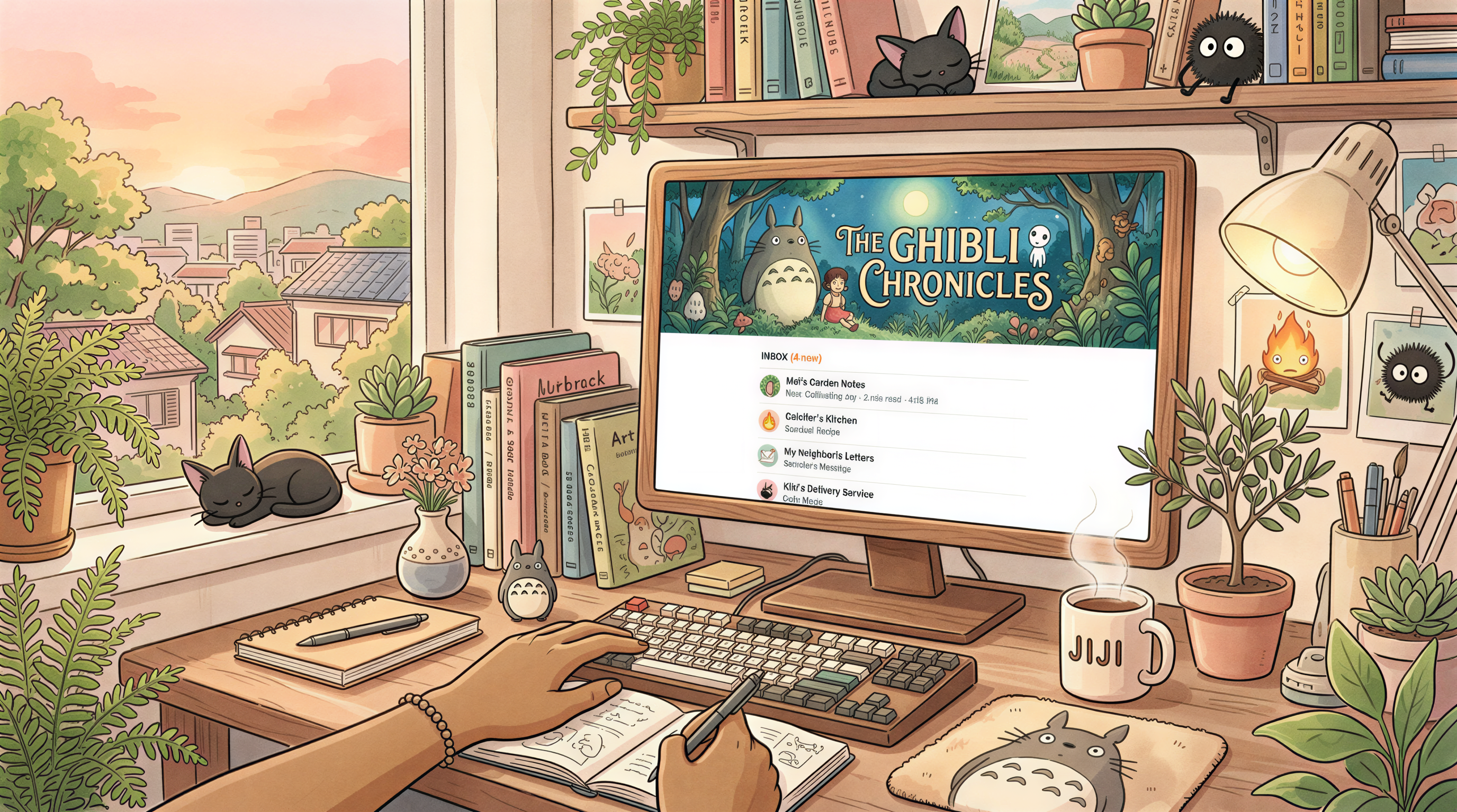
Newsletters That Already Do This Well
(Without naming names) - the ones with 10k+ readers and a 50%+ open rate almost always have:
- Same banner style every week
- 2-4 inline images per issue
- A predictable rhythm subscribers recognize
The pattern is the brand. The brand is the open rate.
Common Mistakes to Avoid
- Different image style every issue - kills recognition
- Stock photo headers - looks like every other Substack
- No alt text - bad for accessibility + bad for the screen reader crowd
- Huge file sizes - slow opens, slower mobile
Compress to under 500KB. Substack will recompress anyway, but cleaner inputs = cleaner outputs.
Cross-Pollinate to Your Blog
If you also publish on a blog, use the same style there. Substack newsletter, blog post, social share - one visual identity across all three.
This is what newsletter writers on Beehiiv and Substack get right. Ones who don't, churn faster.
Build Your Magazine Look This Week
Try it on the next issue.
Open Postpix. Pick one style. Make a header + 2 inline images for your next post.
Send it. See if open rates change after 4 weeks of consistency.
Pricing when you're ready to lock it in.
Generate Your First Blog Banner
Join thousands of content creators who save hours every week with AI-generated blog images.
Pay for credits when you need them. No monthly fees.
Use your credits whenever you need them. No rush.
Use images for any project—personal or commercial.