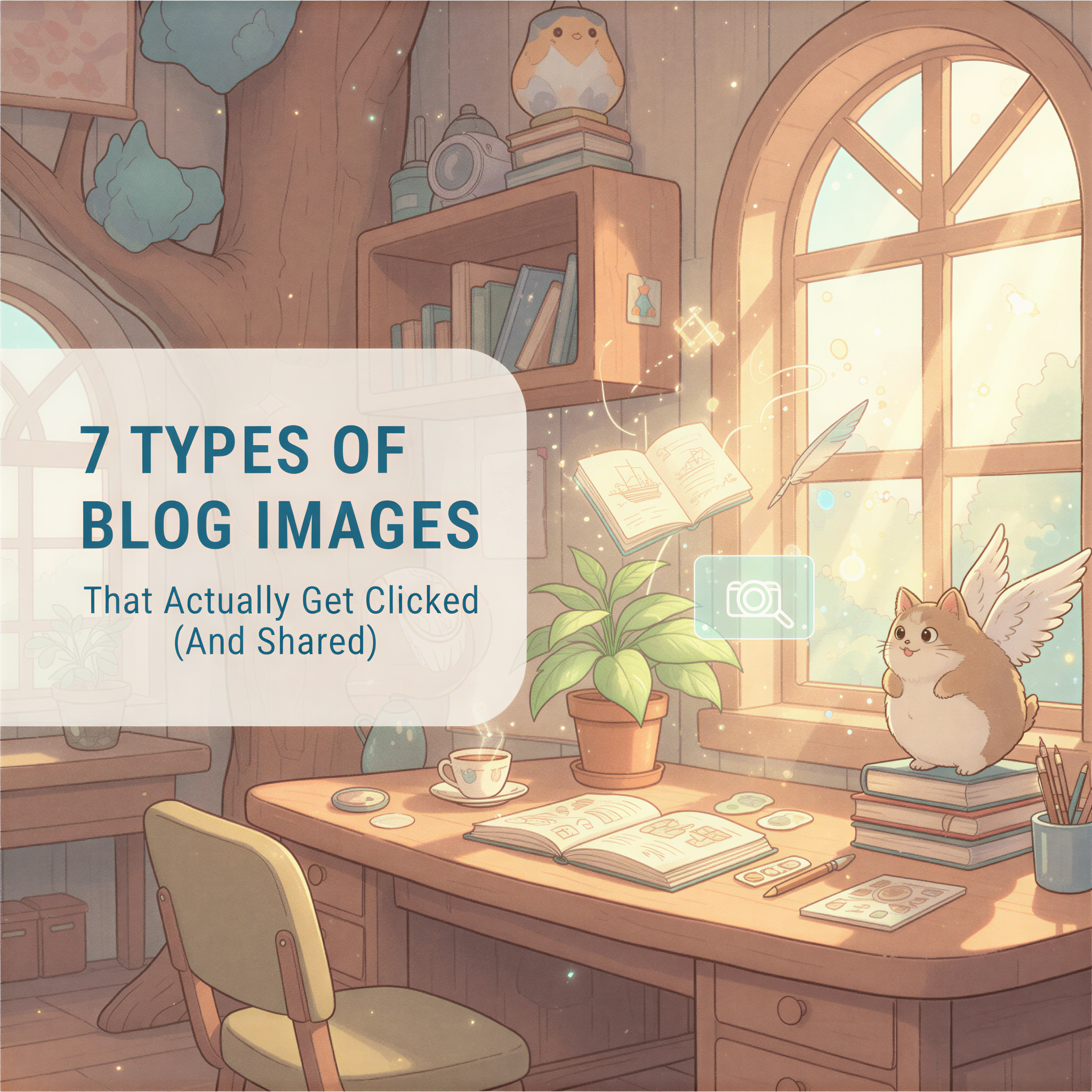
7 Types of Blog Images That Actually Get Clicked (And Shared)
You just spent 3 hours writing a killer article.
Then you grab a stock photo from Unsplash. The one with the person pointing at a laptop. You've seen it 47 times before.
Your readers have too.
They scroll right past it.
Table of Contents
- The Problem With "Good Enough" Images
- 7 Types of Images That Actually Work
- Why Stock Photos Don't Make the List
- The Visual Consistency Problem
- Your Next Step
The Problem With "Good Enough" Images
Most bloggers treat images as an afterthought.
Write the article. Slap on a header image. Ship it.
But here's what the data shows: articles with distinctive visuals get 2-3x more social shares than those with generic stock photos.
Why? Because unique images stop the scroll. They signal effort. They build brand recognition.
And stock photos? They signal "I grabbed this in 30 seconds."
7 Types of Images That Actually Work
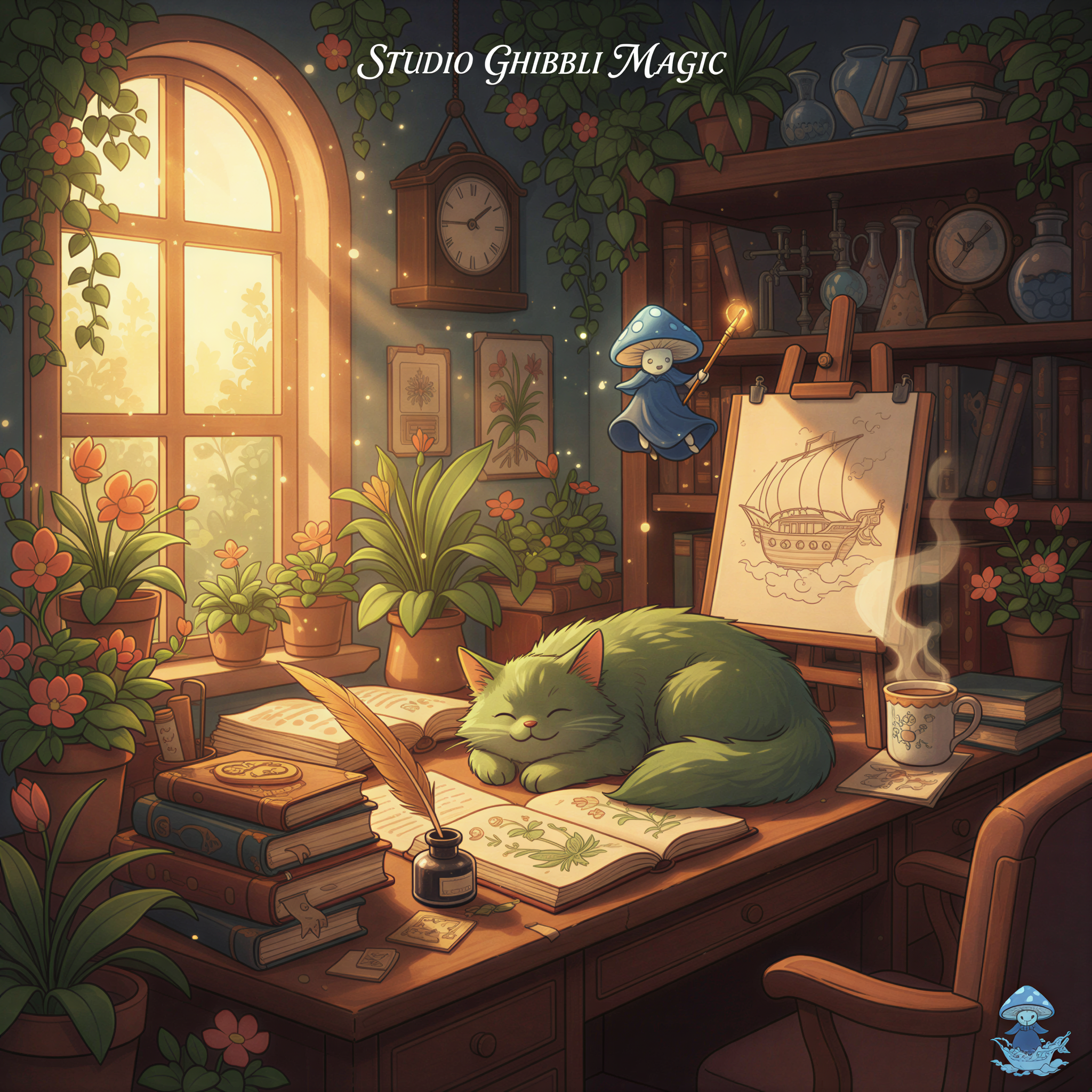
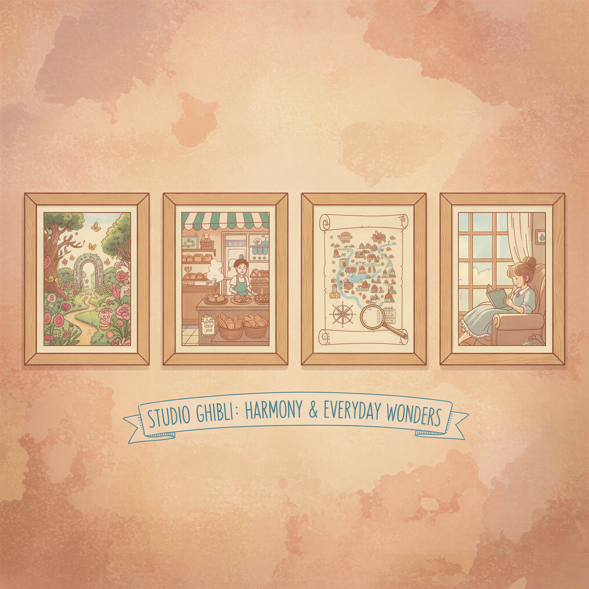
1. Illustrated Headers
Custom illustrations that match your brand style.
Think Notion's blog. Linear's changelog. Stripe's documentation.
These companies don't use stock photos. They use consistent, illustrated visuals that you instantly recognize.
You don't need a design team to do this. Tools like Postpix generate Ghibli-style illustrations from your article content in seconds.
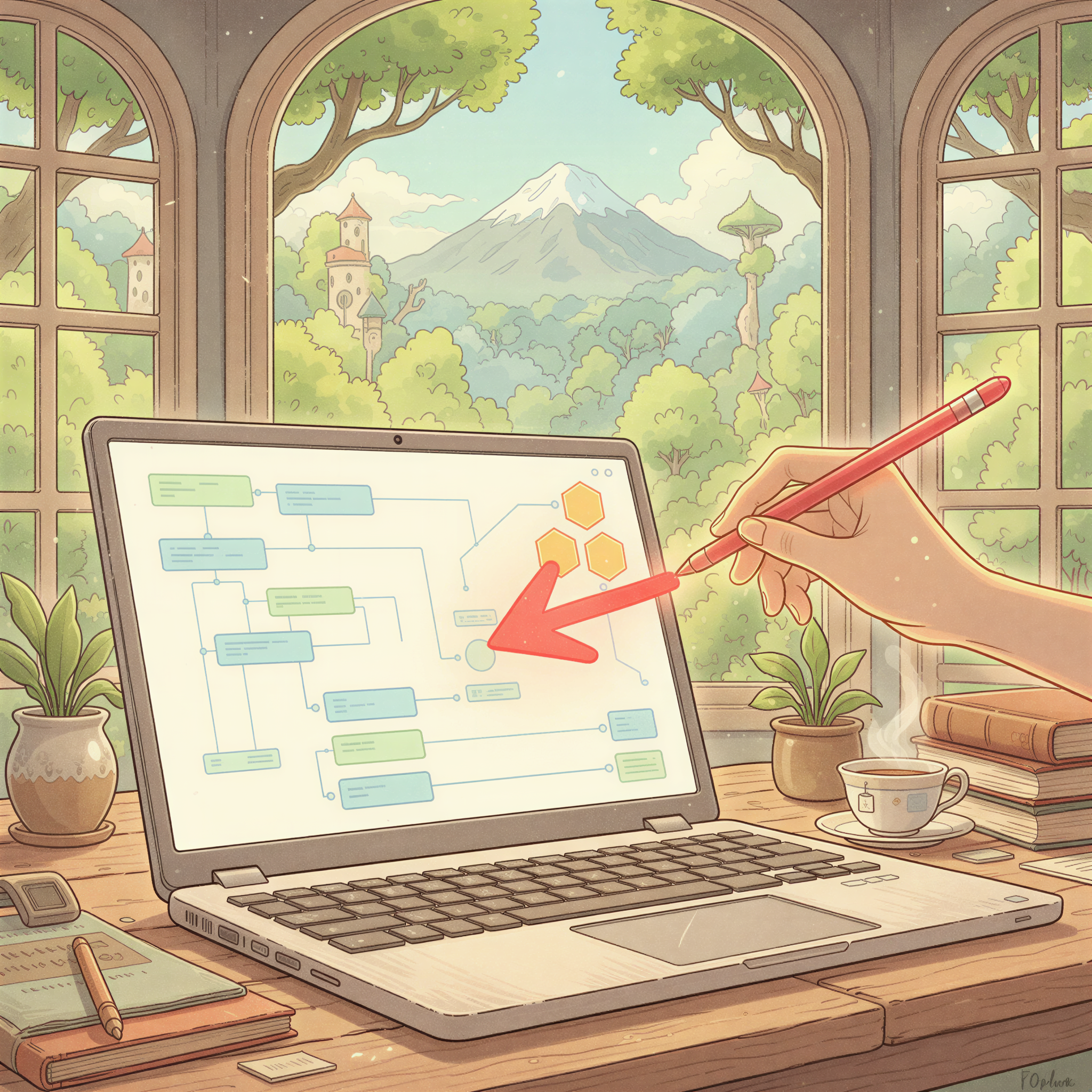
2. Annotated Screenshots
Screenshots with arrows, highlights, and callouts.
These work because they're useful. They show, don't tell.
A tutorial about Notion? Show the actual interface with annotations. Not a stock photo of someone "being productive."
3. Before/After Comparisons
Side-by-side visuals showing transformation.
Perfect for:
- Design tutorials
- Product updates
- Process improvements
The format itself tells a story. No caption needed.
4. Data Visualizations
Charts, graphs, and infographics that summarize your key points.
But not the corporate kind with 47 data points.
Simple. One insight. Big text.
5. Quote Cards
Pull quotes from your article, designed as shareable images.
These spread on social because they're self-contained. The reader doesn't need to click through to get value.
6. Process Diagrams
Step-by-step visuals showing how something works.
Flowcharts. Timelines. Journey maps.
These turn complex ideas into scannable content.
7. Branded Section Images
Consistent illustrations that break up long articles.
Not decorative. Functional.
Each image reinforces a section's theme while building visual recognition for your brand.
This is what we built Postpix to solve.
Why Stock Photos Don't Make the List
Stock photos fail for three reasons:
1. Zero differentiation
Your blog looks like every other blog. Same Unsplash images. Same vibe. Nothing memorable.
2. No brand building
Stock photos don't create recognition. You can't build a visual identity with photos anyone can download.
3. Reader fatigue
We've all seen "person smiling at laptop" a thousand times. Our brains filter it out. It's why stock photos kill engagement.
The Visual Consistency Problem
Here's the trap most content creators fall into:
Article 1: Minimalist stock photo Article 2: Colorful illustration Article 3: Dark moody image Article 4: Bright corporate photo
No consistency. No recognition. No brand.
The fix? Pick a visual style and stick to it.
Ghibli-style illustrations. Realistic AI images. Hand-drawn sketches. Whatever fits your voice.
Then use it everywhere. Every article. Every newsletter. Every social post.
Related: Why Use Ghibli-Style Images in Your Blog Posts
Your Next Step
Stop treating images as an afterthought.
Pick a style. Build consistency. Create recognition.
Here's the workflow:
- Write your article
- Paste it into Postpix
- Generate matching images in your chosen style
- Publish with visuals that actually stand out
Takes 2 minutes. Looks like you hired a designer.
Check our pricing — 5 free images to start.
Your words deserve better than stock photos.
Your readers deserve better than generic visuals.
Build a brand they'll remember.
Generate Your First Blog Banner
Join thousands of content creators who save hours every week with AI-generated blog images.
Pay for credits when you need them. No monthly fees.
Use your credits whenever you need them. No rush.
Use images for any project—personal or commercial.