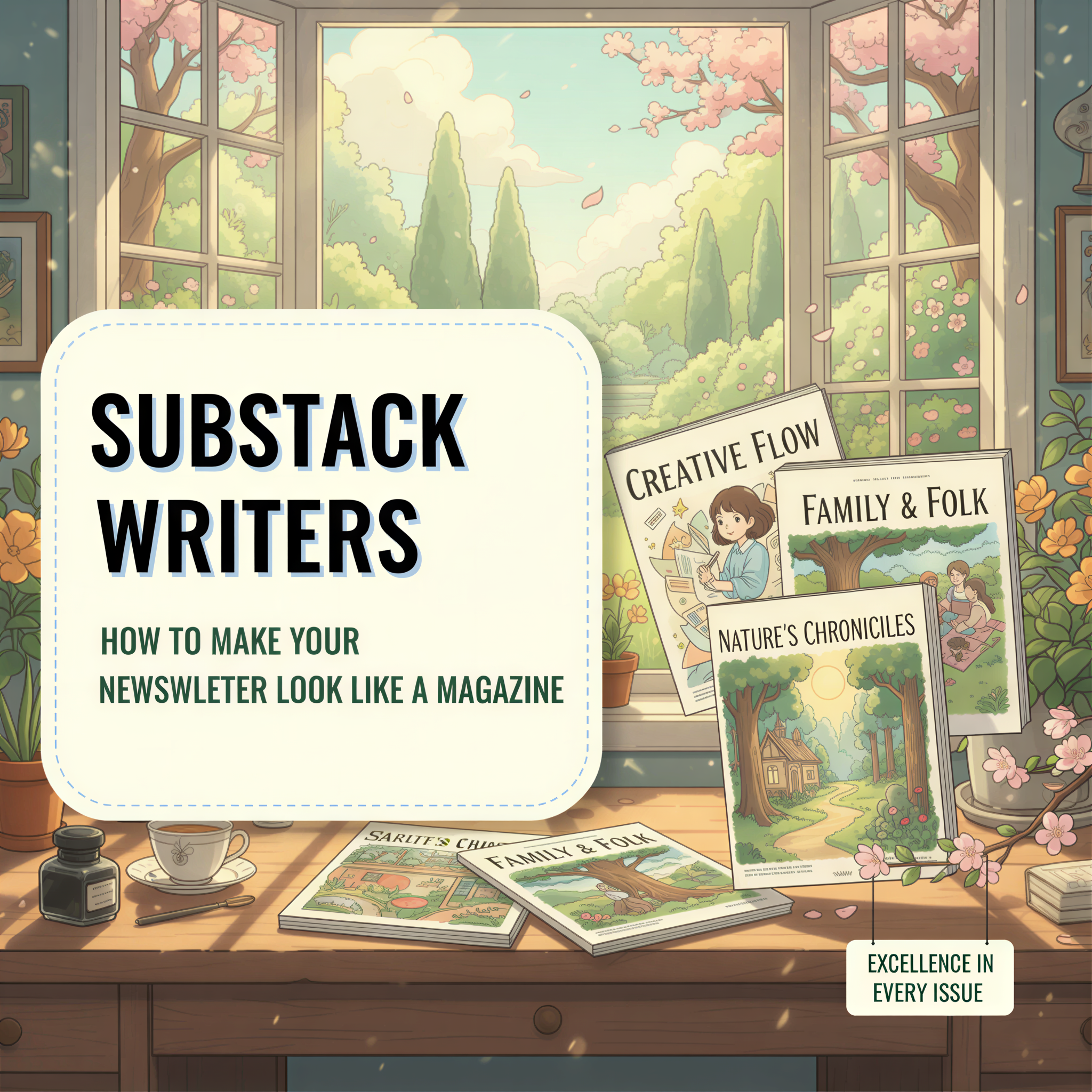
Substack Writers: How to Make Your Newsletter Look Like a Magazine
Your Substack looks like every other Substack.
Same default font. Same white background. Same stock photo header.
In a sea of 30 million newsletters, you're invisible.
The top newsletter writers figured this out. They treat every issue like a magazine cover.
Here's how.
Table of Contents
- The Substack Sameness Problem
- What Magazine-Quality Newsletters Do Differently
- The 3-Image Formula
- Building Visual Consistency
- The 5-Minute Workflow
- Why This Works
- Your Next Issue
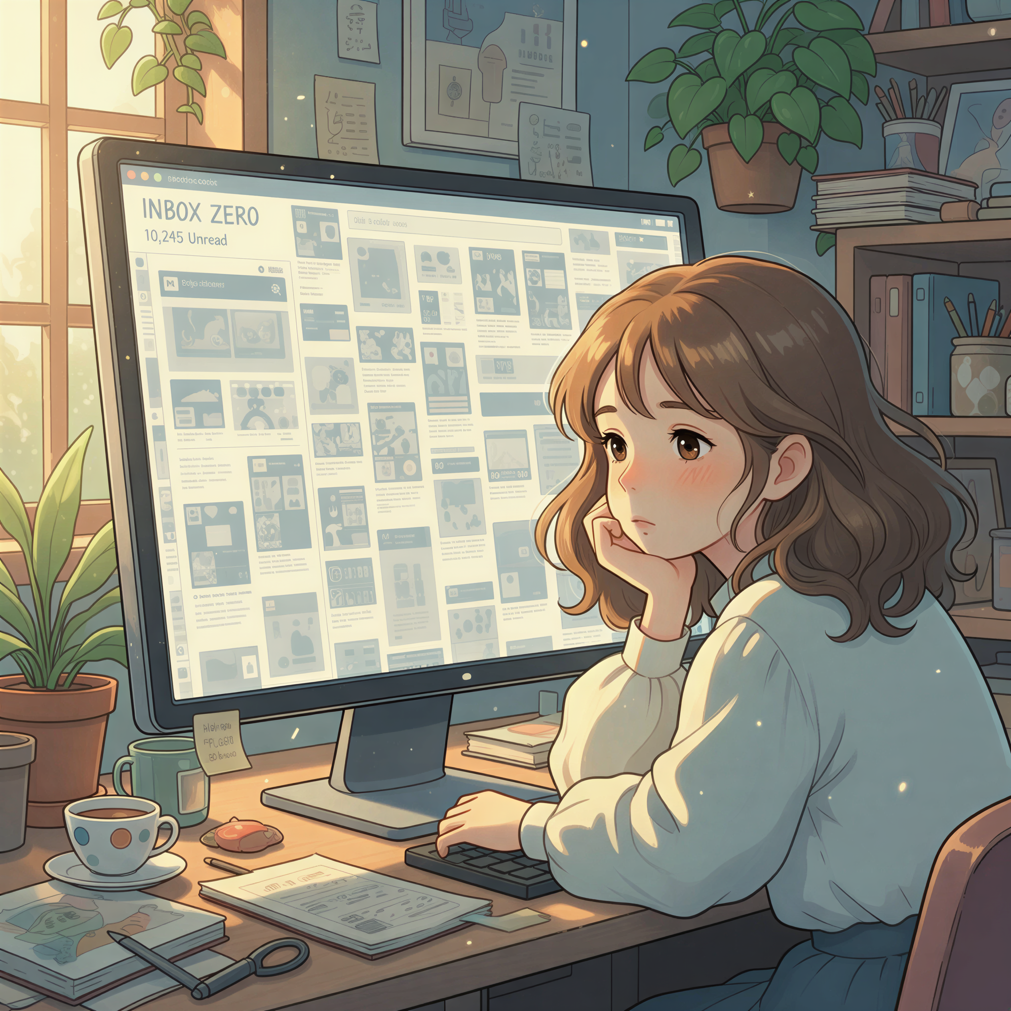
The Substack Sameness Problem
Substack made it easy to start a newsletter.
Too easy.
Now everyone has one. And they all look the same.
- Generic header image
- Wall of text
- Maybe a closing photo
Your readers' inboxes are flooded. Your newsletter is competing with 50 others that look identical.
The preview image in their inbox? A tiny thumbnail that could be anyone's.
What Magazine-Quality Newsletters Do Differently
Open any successful paid Substack. The Diff. Lenny's Newsletter. Not Boring.
Notice something?
Custom visuals everywhere.
- Branded header images
- Section illustrations
- Consistent visual language
These writers understand: distinctive visuals build recognition. When a subscriber sees their style, they know instantly who it's from.
That recognition = opens. Opens = growth. Growth = revenue.
The 3-Image Formula
You don't need dozens of images. You need three strategic ones.
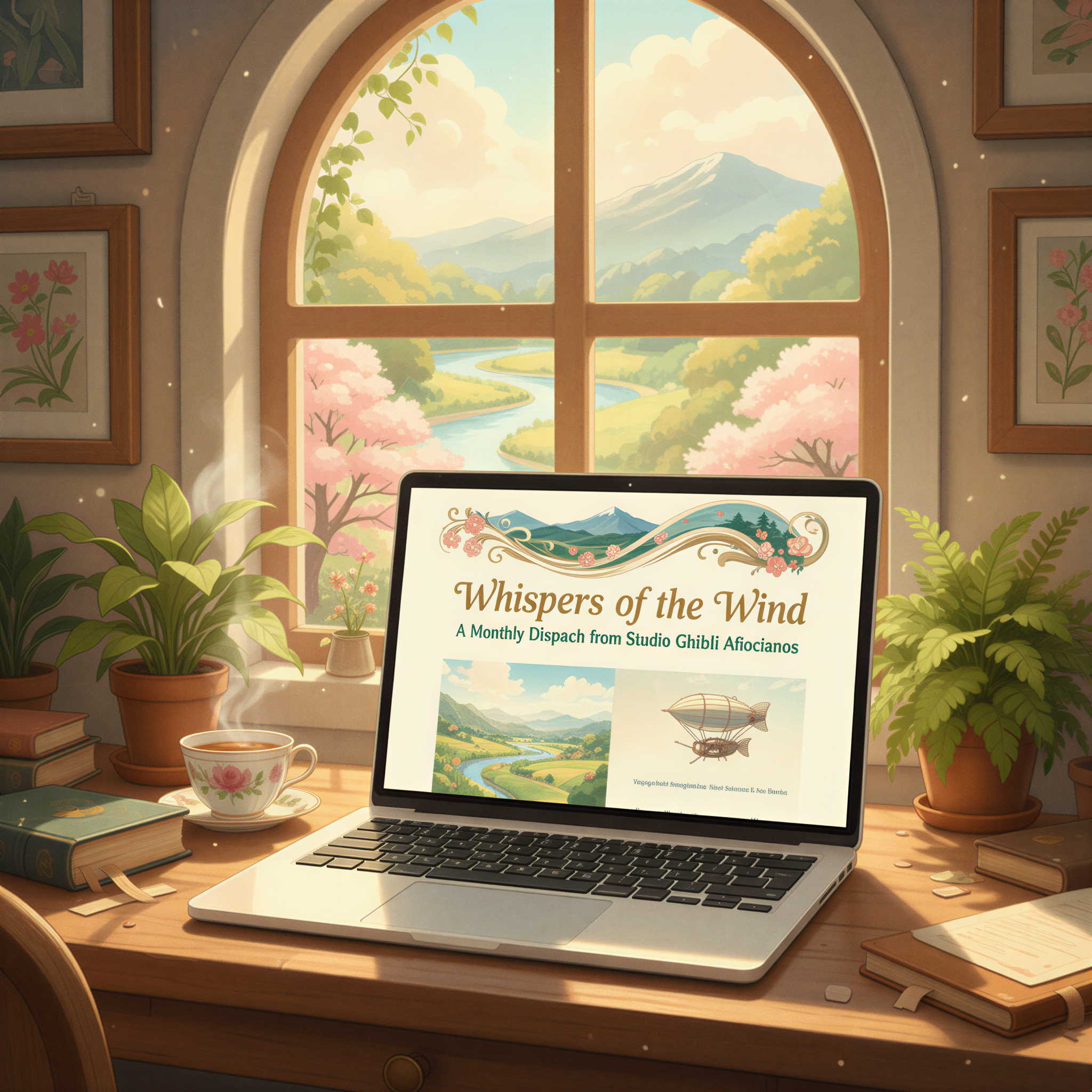
1. The Header Image
This shows in email previews. It's your magazine cover.
Make it:
- Instantly recognizable as yours
- Relevant to the topic
- Visually distinct from stock photos
2. The Section Break
Long newsletters need visual breathing room.
A single image between major sections:
- Gives readers a mental pause
- Reinforces the section's theme
- Keeps them scrolling
3. The Closer
End with something memorable.
A visual CTA. A branded sign-off. Something that sticks.
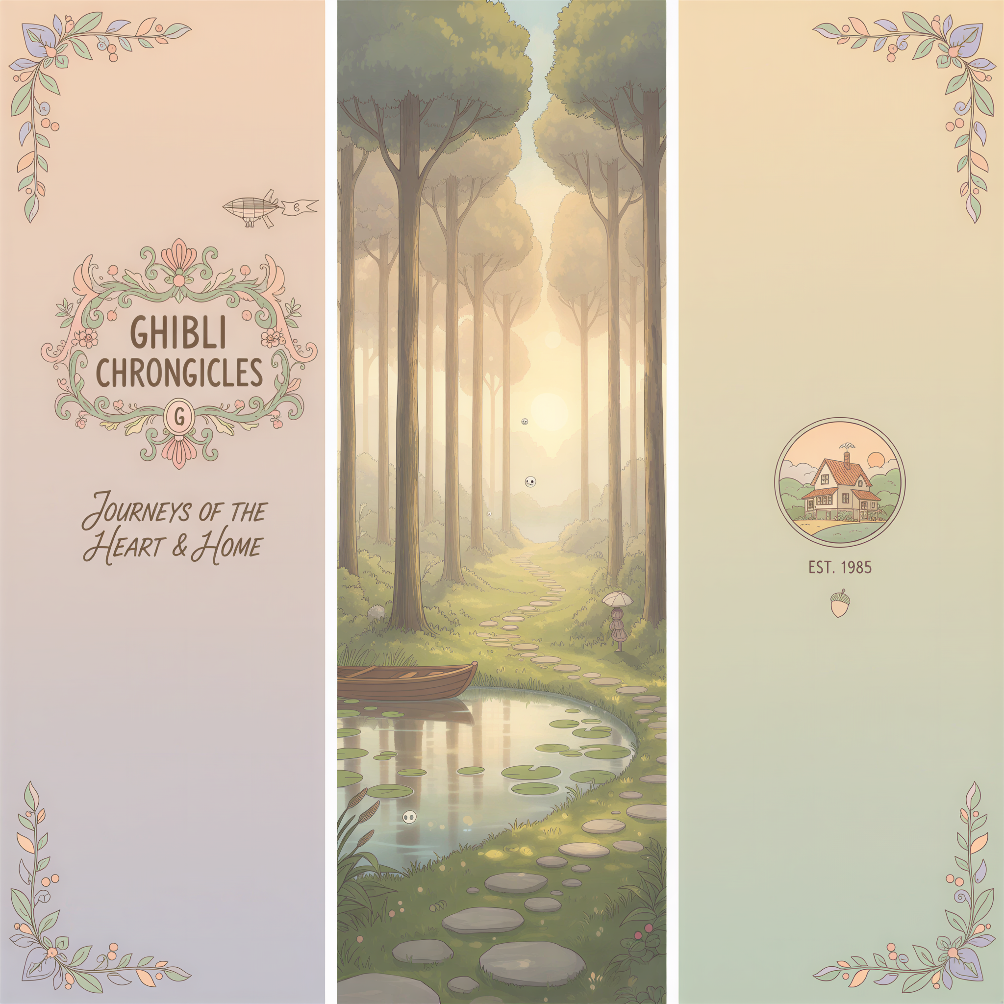
Building Visual Consistency
The key word: consistency.
Don't use:
- Random stock photos
- Different styles each week
- Whatever's fastest
Do use:
- One visual style (Ghibli, realistic, illustrated)
- Consistent color palette
- Recognizable composition
Think of it like a TV show. Same opening credits every episode. Same visual language. You know what you're getting.
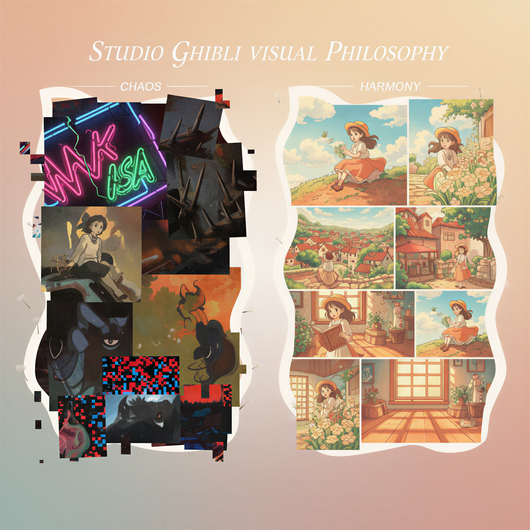
This is what Tibo-style writing does for your words. Now do it for your visuals.
The 5-Minute Workflow
Here's how top newsletter writers create magazine-quality visuals without a design team:
Step 1: Write your newsletter (you already do this)
Step 2: Paste into Postpix
Drop your content into Postpix. The AI reads your newsletter and suggests image placements.
Step 3: Pick your style
Ghibli-style for warmth and personality. Realistic for professional topics.
Step 4: Generate
One click. 3-5 images that match your content.
Step 5: Export and paste into Substack
Done. Magazine-quality newsletter in under 5 minutes.
Why This Works
Subscribers remember newsletters that look different.
When your visual style is consistent:
- They recognize you in their inbox
- They associate quality with your brand
- They're more likely to open and share
Canva can do custom images, but it takes 30+ minutes per newsletter. That's not sustainable for weekly publishing.
Postpix is built for newsletter writers who ship every week.
Your Next Issue
Stop blending in.
Your next newsletter can look like a magazine.
- Write your content
- Generate matching visuals with Postpix
- Build a brand readers remember
Check out our pricing — 5 free images to start.
Your writing deserves visuals that match.
Your subscribers deserve a newsletter worth opening.
Make it look like a magazine.
Generate Your First Blog Banner
Join thousands of content creators who save hours every week with AI-generated blog images.
Pay for credits when you need them. No monthly fees.
Use your credits whenever you need them. No rush.
Use images for any project—personal or commercial.